Field type: single select
The single select field allows a set of pre-defined values to be stored in GraceBlocks. Use the single select field to allow users to pick a single value from a list of values. For example, if you were tracking tasks, you might have a status field that is single select with value options of New, Assigned, In Progress, Done, and Cancelled. To configure this type of status field, a builder must choose the Single select field type when managing fields.
This article reviews the properties of single select fields and provides tips to aid in user adoption of this type of field.
You can view the available properties for single select fields on the Edit field properties modal when you select Field type of Single select.
Properties of Single select fields

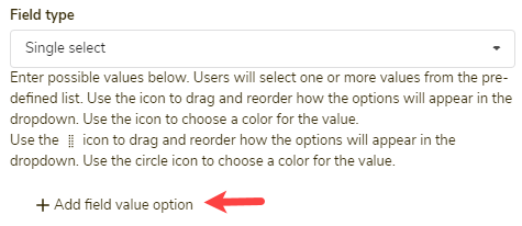
After specifying a Field name (which controls how this field is referenced inside the tab) and that the field is of the type Single select, you need to enter the list of values for your single select field by following the steps outlined below.
| Step | Action | Visual | ||||
| 1 |
Click + Add field value option. The field option entry field appears. |
 |
||||
| 2 |
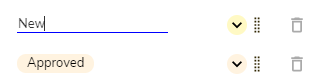
Enter the first value into the entry field, and then press Enter. Every time you press Enter, a new entry field row will appear. |
 |
||||
| 3 |
Continue entering values as needed and pressing Enter until you have entered all values you want to include in the list. |
 |
||||
| 4 |
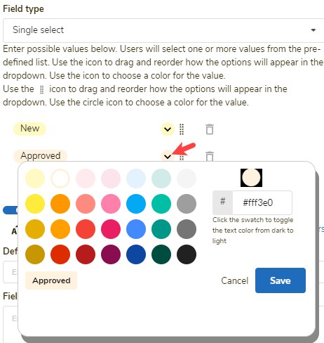
A color is automatically assigned to each value. To choose your own color, click the color dropdown to the right of the value. The color picker appears. |
 |
||||
| 5 |
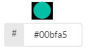
Confirm the color by clicking a color bubble (1). If you would like a custom color (supported on paid plans only), enter the custom hex value into the hex value box (2). |
 |
||||
| 6 |
Choose whether the text overlaying the bubble will be white or black by clicking the color bubble above the hex value. Each time you click the bubble, the text color toggles between white and black. |
|
||||
| 7 |
Click Save inside the color modal to save the color option. |
 |
||||
| 8 |
Repeat steps 3 - 7 until you have entered all values. |
|||||
| 9 |
Click the trash can icon to remove items you have mistakenly added. |
 |
||||
| 10 |
Click the text of any existing value to shift it back into edit mode so that you can edit the text of the value. |
 |
||||
| 11 |
Use the drag icon to reorder items in the list. |
 |
||||
| 12 |
Click Save on the Edit field properties screen to save the single select field and all of its defined properties. |
 |
You can also configure additional properties, defined in the following table. Toggle on More field attributes to show the following options:
| Property | Description |
| Private field | Use this setting if only authorized users should be able to access this field. If this is applied, the field will be locked out from the user's view entirely unless they are authorized to access private fields. This setting works in conjunction with the security access control tab setting: View private fields. If a field is private, only users authorized to view private fields will be able to view, edit, see history, filter, or download this data. Click here to learn more. |
| Alphabetize |
Click this option to sort the list of values you have entered alphabetically.
🔔 If you enter new values, and you want them alphabetized, click this button after you have added all values. |
| Enable colors |
If you do not want the value options to have colors, toggle this option to the off position. When this option is off, all values appear as dark text on white background.
|
| Default text |
If every row should have a value by default as soon as a record is created, specify the default value here. Users can change the value, but setting a default can help to minimize the number of null value records. 🔔The default value text must exactly match an option in the list of values. In the example above, a likely default would be the value New, which would allow all records that a user enters to start with a status of New. |
| Field callout |
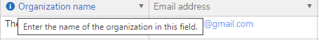
If you enter any text into the Field callout textbox, the information (i) icon appears to the left of the field name, and the text you entered displays when users move the cursor over this icon. Enter text here if you want to provide information to help the user learn more about how to use the field.
|


Important notes
🔔 If you have a long list of values, consider making a new tab for the values and creating a relational field instead.
🔔 If a data-conversion impact can occur during a field type change to or from a single select field, a warning message accompanies the field-conversion process to ensure that the builder understands what to expect. It's important to read these messages carefully. Users must follow the instructions provided on the warning page to complete field change transactions.