Using quick view
When you access a tab in GraceBlocks, the layout of the information presented is based on the view. The recommended layout option for Block users (those who are not Builders) is called quick view. This view presents information in a simplified grid layout with columns and rows. Each row represents a record and each column represents a field. This is the speediest of all views in terms of loading information on the page for users. Unless you are building or need to edit lots of records at once (an option only possible in spreadsheet view), this is the recommended primary view for all users.
This article covers:
Viewing quick view
By default, when you click to access a tab in GraceBlocks, its highly possible you have started in quick view. In fact, it is possible that quick view is the only view option available. In cases where you do have more than one view, follow the steps below to access quick view.
| Step | Action | Visual |
| 1 |
Click to access any tab inside the block (other than the home tab). 🔔 The home tab is always reserved to share information prescribed by a builder when they design the block. |
|
| 2 |
The tab displays, most likely in quick view. Success! or If this type of layout does not display, proceed to step 3.
Note: Unless an alternative public default bookmark has been set, users always start in Quick view with the row height set to the Medium height level. |
|
| 3 |
Click the quick view icon (lightning bolt) to toggle over to spreadsheet view.
The view toggle icons appear only if options in addition to quick view exist for the tab. |
|


Working in quick view
Working in quick view lets you quickly see information and easily drill into details. Review the table below to understand the actions available from this page. The numbers in the illustration show where to find each action on the layout.

- Refresh: Click the Refresh icon to refresh the records on the page. This option might be useful, for example, if you have just sent a series of text messages and you want to see quickly which individuals have responded. Or, if other individuals are also using the data at the same time, clicking Refresh applies their latest updates to your view.
-
Download: Click the Download icon to download records. Clicking this option generates a .csv file that includes all columns and rows in the view (inclusive of scrolling). To learn more, see downloading records. (This option may be hidden if your role and associated security level do not allow this function.)
-
Share: Click the Share icon to share records with non-users of GraceBlocks. Clicking this option makes a sharable link available. To learn more, see sharing records. (This option may be hidden if your role and associated security level do not allow this function.)
-
Print: Click the Print icon to print records. You can determine what information is printed in an aggregate PDF file, with one or more pages that represent each record. To learn more, see printing records. (This option may be hidden if your role and associated security level do not allow this function.)
-
Height*: Select one of the three height options to determine how tall each record row will be. (In this view, the default landing height is Medium). There are three icon options:
| Height | Icon | How records will display |
| Short | ||
|
Medium |
||
| Tall |


-
View: Click one of the View options (if more than one is available) to select the view in which you work. This area is where you select the quick view, provided that more than one view type is available. If only one view type exists, this option and the associated icons do not display.
-
Columns: Click the Columns icon to access the column settings for the page. From this modal, you can drag to reorder columns or click the hide/show icon to hide/display columns. To learn more, see managing columns.
-
Bookmarks: Click the Bookmarks icon to access and create bookmarks. A bookmark is essentially a saved version of the page, including any filters you applied, as well as column width, display, and order layout. When a user accesses a tab for the first time, the "public default" bookmark displays. To return to the original starting point, you can always click the Bookmarks icon and then select the bookmark that is set as the "public default." To learn more, see managing bookmarks.
-
Filter: Click the Filter icon to filter records. From the search filters modal, you can choose filter fields, enter criteria, and then apply the filter criteria. To learn more, see filtering records.
-
Add new records: Click + Add new record to add new records. Here's a preview of this button when you hover the cursor over it.
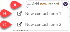
By default, there is a basic form behind the add new record button (A above). However, if a builder has created web forms and made them public, these additional forms can appear as dropdown options in addition to the main button (B & C above). The main Add new record button (A) can power the basic form offered by GraceBlocks, or — if the builder has set a "public default" — this button will launch that form instead. If multiple options exist (the button plus named forms below the button), follow the instructions of your builders regarding which option is best for you to use to create new records.
-
Oldest first | Newest first: Sometimes it's easiest for the newest records to be at the top; other times, a chronological sort by date added works best. Click Oldest first to toggle the display of spreadsheet view to show the oldest records first; click Newest first to toggle the display to show the newest records first. By default, records are sorted from oldest to newest unless you have clicked this toggle (to flip to newest first) or have selected another sort option. (See #13 and #14.)
-
Field option (sort ascending/descending): Click a column header to sort ascending, and click again to sort descending. (This option is not supported for multi-select fields).
-
Filter criteria: If any filter criteria or field-specific ascending/descending sorts have been applied, these attributes are each listed as a bubble in the Filter criteria field to explain what attributes define the content that is displayed on the page. To remove any criteria click the X at the end of the filter criteria bubble. Most criteria syntax is self-explanatory, but an explanation may be helpful for the following criteria syntax:
| Syntax | Meaning |
| (c) | contains |
| (nc) | does not contain |
| (sw) | starts with |
| = | equal to |
| != | not equal to |
| incoming | The last message was incoming* |
| outgoing | The last message was outgoing* |
* Only applies for messaging fields
-
-
Total records: The Total records number is the total number of records saved in the tab, regardless of any filters that may or may not be applied.
-
Viewing x of y records: In the Viewing x of y records field at the bottom of the view, the first number (x) is the number of records loaded in your browser session currently. If there are a lot of records, it may be that only the first 500 of 25,000 records are loaded in your browser. In this case, x would be 500. The second number (y) is the number of total possible records that are available, according to any filter criteria that have been applied. If no filters are applied, y is equal to the number displayed for Total records in #17.
-
Support button: This button is deprecated. All support is through the circled question icon in the very top bar of the page.
-
First column freeze line, column resize: The first column in this view will persist. This line represents where the first column is frozen in place. Other columns to the right are accessed using the horizontal scroll bar, but the first column to the left of this line will remain in place. Every column has a "line" that when hovered over will allow you to resize it. (The only line that is visible on the page is the first column, the rest are invisible but can be found with your mouse by hovering.)
-
Record identifier and link to details page: Each record is identified in the first column by their record identifier, as defined by the builder. For any record, this identifier is linked, click the link to access the details page for the record. Unlike other columns, when you resize this one, the system will not remember your referred width, but you can resize it with each visit to the page. See step 2a of managing tabs to learn about the record identifier. Also, learn more by reading about the details page.
-
Horizontal scroll bar: A horizontal scroll bar appears if more columns exist in the layout than can be viewed on the screen at one time. Use the scroll option provided to navigate to the left and right of the screen to view and work with all available record data.
-
Vertical scroll bar: A vertical scroll bar appears if more rows of records exist than can be viewed on the screen at one time. Use the scroll option provided to navigate up and down the record list.
-
Additional quick view options when grouping is in use
Working in quick view when grouping has been activated under column settings adds some additional capabilities to the page. Grouping organizes information into up to three grouped clusters of information that you can interact with using the options outlined below. The illustration below illustrates when all thee groups are in use.
*The grouping is only available on paid plans.

- Group 1 - expanded. Click the down carrot to collapse an group. The first grouping in this example is on a status field. It's illustrated in expanded mode showing "completed" items. The numbers to the right of the value illustrate two things - the number of subgroups followed by the number of records. In this example ( 6 - 385) there are 385 total records that are in 6 groups (for the 6 individuals who are responsible for the items).
-
Group 2 - expanded: Click the down carrot to collapse an expanded group. The second grouping in this example is on a person-responsible field. It's illustrated in expanded mode showing "Amanda Wiggen's" items. The numbers to the right of the value ( 5 - 79) illustrate that Amanda has 79 completed items which fall across 5 functional domains.
-
Group 3 - collapsed: Click the up carrot to expand a collapsed group. The final grouping shows records by "functional area." The first two areas are illustrated in collapsed mode. The number to the right represents the number of records in this group, in this case, there are 38 records in the Core HR/PR group.
-
Group 3 - expanded: The lowest level group, when expanded will show the actual records in the grouping. You can resize any columns from this layout as desired.
-
Collapse all: Click this to collapse all groups.
-
Expand all: Click this to expand all groups.
-
Group number aggregation: Click the down arrow in the grouping section above any numeric field to adjust the calculation that is done on that number. By default, a sum for the group will appear. Options available include Sum, Average, Min, Max, Median, and Range. Each Group Level calculates together. For example, if one group 3 item's calculation is changed then they all change (changing Timekeeping will also change what is reflected for Project Management and Core HR/PR, but will not change Level 1 (Status) or Level 2 (Person responsible) grouping calculations.
🔔 The collapsing and expanding of a group's layout will be saved with any bookmark you create while interacting with this layout.
- aka quickview