Details page
The details page provides an expanded view of all of the information about a record inside a tab. You access it by clicking the first column in the tab, which will be either a details icon (📃) or a hyperlinked number (such as 23) that corresponds to the system id of the record.
The content and layout presented inside the details page is primarily controlled by the latest Block builder through the design they have specified for the page. If you are a Block builder, see configuring the details page to learn more about this design. End users can also personalize some aspects of the details page. The following diagram and annotations outline the elements and operations of the details page. They also highlight personalization options for end-users who do not have Block builder capabilities.
The details page includes two main areas, and within these areas are sections, which can appear as shown in the following graphic:
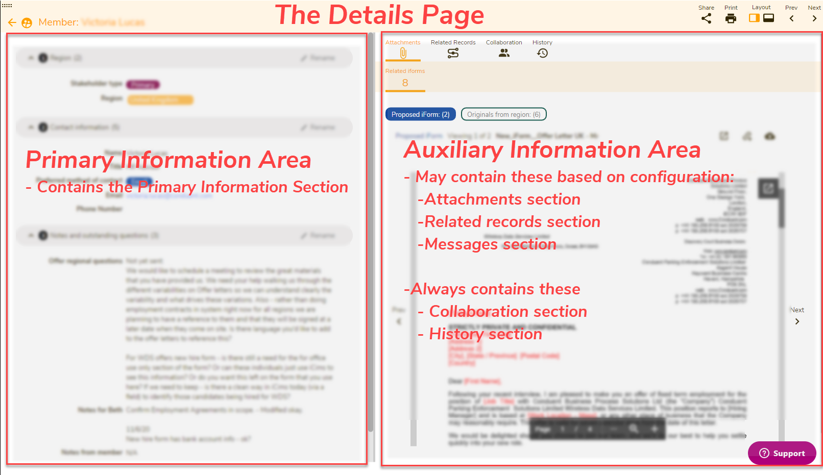
| Area | Section | Description |
| Primary information area | Primary information section | The left side of the details page contains only one section. Most fields associated with the tab and any sections a builder configures for organizing this information appear here. |
| Auxiliary information area |
Attachments section | If attachments are configured into the tab by a builder, they appear in this section. |
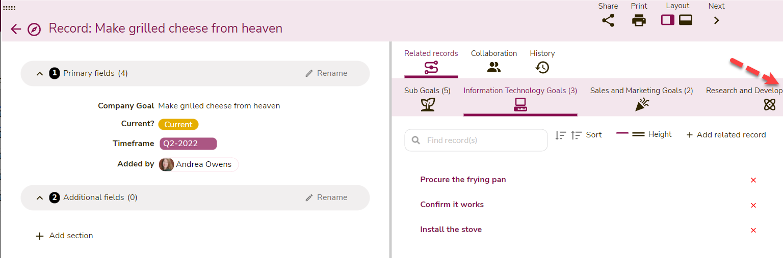
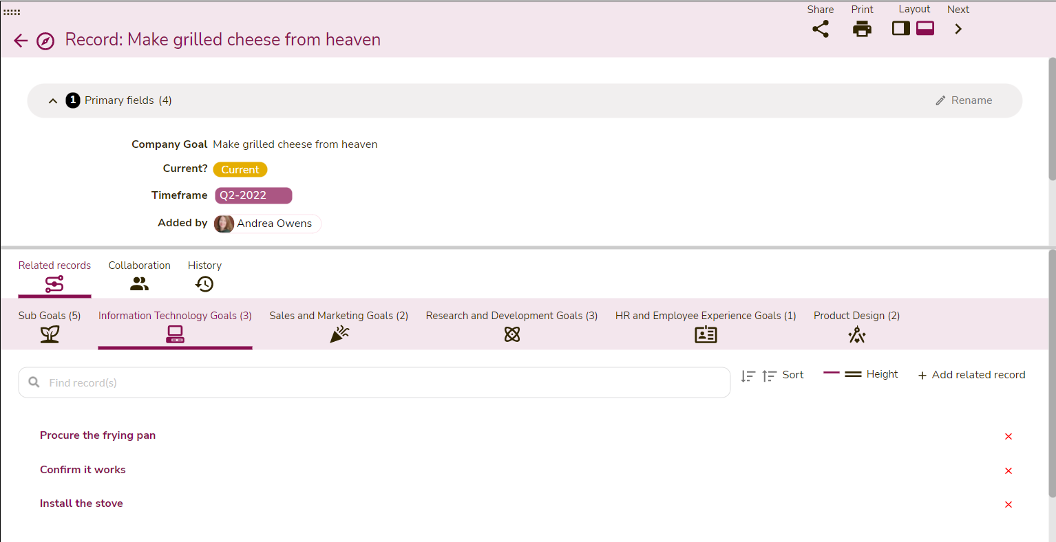
| Related records section | If multi-select relational fields are configured into the tab, they appear here. | |
| Messages section | This section appears if a builder configures the message thread field into the tab. | |
| Collaboration section | Collaboration between users appears in this section. This feature is currently in development. | |
| History section | History tracking of changes made to records will appear in this section. |
The following graphic shows the relevant elements on the details page, and the table below describes how they work on the details page.
| # | Item | Description |
| 1 | Detail field | Most of the data fields on the details page are editable if you are authorized. If you want to edit a field, click Edit (21). If you are not authorized to edit a field, you will see the lock icon with a notice (17). |
| 2 | Relational field (single select) | Fields that are related to another single record inside GraceBlocks are displayed at a lighter shade of the Block color. You can click the value directly to launch the related record on the details page. Doing this causes breadcrumbs to appear in the page's Title bar (see #14 below). You can use that to navigate the records. Click here to learn more about related records. |
| 3 | Lookup-fields | Records pulled in from another related record connection appear gray or light yellow background. They represent lookup fields. Click here to learn more about lookup fields. |
| 4 | Section | A grouping of fields. You can click the arrow to the left of the section number to expand or collapse the section. Builders configure page sections while editing the page. Click here to learn more about configuring the details page. |
| 5 | Drag icon for details page size | Icon that you can drag horizontally to define the overall space on the page that the details page consumes. For each tab, you can use this drag icon to personalize how much space is used by the details page. The system remembers the space you define with this icon and uses it to set the page size the next time you visit a record on the same tab. |
| 6 | Section bar | This bar separates the page's primary (shown on the left) and auxiliary (shown on the right) sections. For each tab, you can click and drag this bar to personalize how much space is taken up by these sections of the page. The system remembers the space you define with this icon and uses it to set the section size the next time you visit a record on the same tab. |
| 7 | Details view launcher (icon or hyperlinked system ID) | The first column in the tab, which you can click to launch the details page. The record that is currently displayed has a blue square around it. You can click the detail icon for any record to jump to it in the detail page view. |
| 8 | Next/Previous icons | Click these icons to navigate to the next or previous records in the list. |
| 9 | Layout icons* | Icons that let you choose either a horizontal or vertical layout. The current layout is illustrated by the icon that is the color of the Block. In this case, the current layout is the horizontal layout. If you switch to a vertical layout, the primary section will be on top, the auxiliary section will be on the bottom of the page, and you can use the section bar (#6 above) to adjust how much space is provided to each section. |
| 10 | Messages | Only appears if text messaging is activated in the tab. Click here to learn more about messages. |
| 11 | Related records | Fields that have many records that have been configured as related to the record being viewed. You can add, remove, and create new related records (if authorized) from this area. You can also click the value directly to launch the related record on the details page. This will cause breadcrumbs to appear in the Title bar (see #14 below) of the page. You can use the breadcrumbs to navigate the records. Click here to learn more about related records. |
| 12 | Attachments | Any attachments directly related to a record or connected via a lookup are visible in the attachments section. Click here to learn more about attachments. |
| 13 | History | Any changes to fields associated with the record will appear here, including details about the field that changed, who changed it, and when. Click here to learn more about history. |
| 14 | Title Bar | The record being viewed. If you have drilled to related records (see #2 or #11 above), the title bar appears as a breadcrumb, and you can click each record in the breadcrumb individually. |
| 15 | Exit detail view arrow | Back arrow that you can click to exit the detail page and return to the spreadsheet view of the record list for the tab. |
| 16 | Expand/Collapse icon | While not directly related to the details page, you can use the collapse icon to minimize tabs to display only their icon representation. You can do this if you would like more space for viewing the details page. The diagram shows the collapsed view of the tabs navigation in the far left panel. |
| 17 | Security notice (only appears when applicable) |
Users who are not authorized to edit a record they can view according to their security role and access level will see this notice. If a user sees this on the details page it means they are only authorized to view the record but can not edit the details of the record or associate any related records or attachments to the record. Users who do not see this notice are authorized to fully edit the record according to their security role and access level and will see the edit icon (discussed in 21 below). |
| 18 | Collaboration |
Use this option to view messages and share information with other Block users about this specific record. In the collaboration panel, you can @ mention someone and they will immediately be notified according to their notification preferences for the Block. |
| 19 |
Share |
Click this to share the record with a non-user. Click here to learn more about sharing records. |
| 20 |
This feature is still under development. |
|
| 21 | Edit |
Users who do not see the security notice (outlined in #17 above) will be able to edit the primary fields associated with the record by clicking the Edit icon. Once in edit mode, save changes by clicking Save (which keeps you in edit mode while saving changes) or Save and view (which saves changes and returns the screen to view mode). Clicking cancel will return the user to view mode without saving any edits.
|

*🔔 Regarding Layout: Choose the layout that will work best for your data. If you have lots of related records or attachment fields, the alternate vertical layout may work best.
|
The horizontal layout feels scrunched when there are many related record fields
|
In this scenario, the vertical layout works much better!
|
|
|
 |