Configuring the details page
On the details page, you can easily see all of the information on a tab. If you are managing a lot of information about records, the details page can be a very useful way to organize information to make it easier for Block users to work and understand what is being tracked. Any builder for a given Block has the ability to configure how the information will appear at the top and on the left and right sides of the page.
The configuration that a builder has most recently defined for the details page on a tab determines the information layout that ALL users will see when they visit the details page for any record of that tab. This article covers the following:
- Top: Configuring the heading of the record
- Left side: Configuring sections and ordering fields on the page
- Right side: Configuring whether attachments, related records and/or message options appear
Top: Configuring the heading of the record
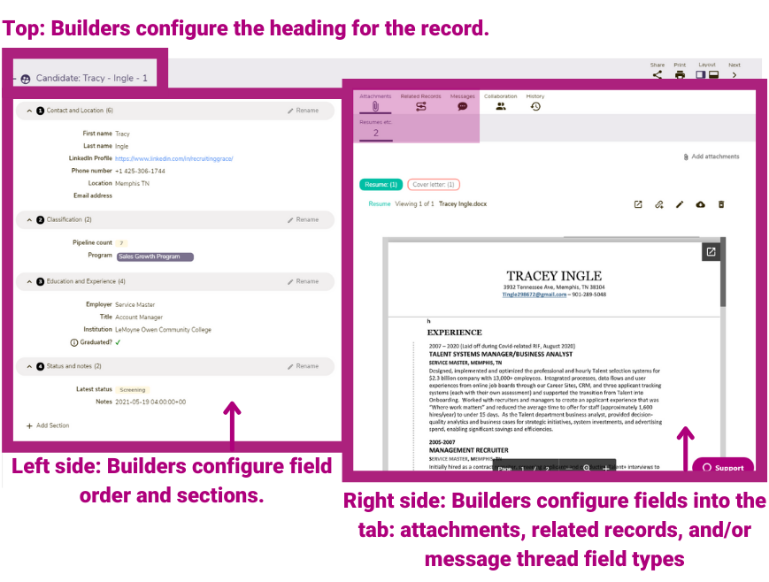
The icon, record name, and record identifier determine how the heading appears on the details page. This is an important visual aspect for users in explaining the information they are working with. There are three elements to the heading: the Icon, Record name, and Record identifier, as illustrated in the example below.

Builders configure this information by following the steps outlined below, which are also discussed in managing tabs.
| Step | Action | Visual |
| 1 |
Click the tab where you'd like to configure the icon and/or record identifier.
|
|
| 2 |
Click the Actions dropdown for the tab, and then select Edit tab properties. |
 |
| 3 |
In the Record name field, enter the record name. Typically, it is best to use a singular instance of the tab name. For example, if Candidates is the tab name, use Candidate for the Record name. |
 |
| 3 |
In the Icon field, scroll through or enter search criteria to find and then select an icon that represents the record you are working with. |
 |
| 4 |
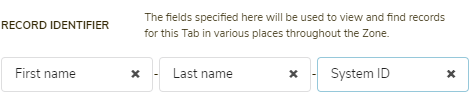
In the record identifier field, select up to three fields (one in each of the dropdowns) from the tab that you'd like to use to help identify the record. When rendered, the selected fields will be separated by a dash (-). For example:
🔔 If you leave a field blank, it will be ignored. 🔔 You cannot configure text area and multi-select value options in the relational identifier field. |
 |
| 5 |
Click Save. |
 |


Left side: Configuring sections and ordering fields on the page
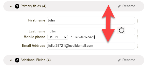
The left side of the details page is where most fielded data about a record reside. This information can be grouped into sections. Builders can create as many sections as they need to optimize the layout of information presented on the details page. Then, builders can drag the fields into their desired order within each section. In the example below, 4 sections (indicated by the red arrows) have been configured, and fields have been grouped and ordered in these sections. (The purple arrow shows where to go to add a new section.)

| Step | Action | Visual |
| 1 |
Click the first column, a details icon a hyperlinked ID or Record Name (what appears in the first column will depend on the configuration and/or view) See managing tabs to learn more.
The details page loads.
|
|
| 2 |
Click the Edit button to enter building functions for the primary section. The primary section of the details page loads in edit mode. Fields and sections can not be manipulated if you have builder capabilities in this Block. |
 |
| 3 |
Review the fields on the page, and decide the best way to group the information. 🔔 Before any configuration by a builder, the default layout includes two sections: Primary fields, where the first three fields will reside; and Additional fields, where all other fields will reside. (GraceBlocks recommends that before you configure your sections, you first configure your fields so that you know what you will track in the tab.)
|
 |
| 4 |
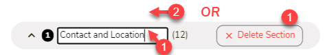
If you choose to rename or delete an existing section, click Rename. The current section label name changes to edit mode and the Rename button converts to a Delete section button. |
 |
| 5 |
To rename: Enter the desired name for the section, then click anywhere outside of the field for the changes to apply automatically. The section is updated reflecting the new name.
To delete: Click Delete section. The section is deleted, and subsequent sections are automatically renumbered. (If you delete section 1, as shown in the example to the right, section 2 becomes 1.) 🔔 The delete action deletes only the section; it does not delete the fields that were in the section. |
 |
| 6 |
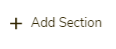
To add a new section, click + Add section, located after all of the fields on the page.
Clicking this button adds the section automatically, with a default name of New section. |
 |
| 7 |
Repeat steps 3 and 4 above to customize the name of any sections you have added. |
|
| 8 |
Click and drag the sections and fields into their desired locations. |
 |
| 9 |
Once the layout is how you would like it to appear for all users. Click Save and view.
The system returns to view mode of the details page.
🔔To save any edits as you go, click Save to save your changes and remain in edit mode. |
 |

Right side: Configuring whether attachments, related records, and/or message options appear
The content on the right side of the details page is controlled by the builder's management of the fields in the tab. This is something builders can do while working in spreadsheet view. If certain fields are included in the tab, the corresponding section appears.
| Field type | Details |
|
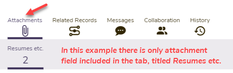
Attachments
|
If one or more attachment fields, or lookups of attachment fields, are added to the tab, then the Attachments section will appear in the right panel as the first (left-most) option. A sub-option representing each field included will appear in the gray sub-section.
|
|
Related records |
If one or more relational fields have been added and configured as "multi-select," then the Related Records section will appear: The order of the related records will correspond directly to the order in which they appear to the user when viewing the list of records in either spreadsheet view or quick view. |
|
Messages |
If the messaging thread field (which can only be added once to a tab) has been added, then the Messages section will appear:
(Note: This section has moved locations to be the first one in the right panel.)
|