Building web forms
Web forms are a powerful tool that allow builders to create on-brand web experiences that can support the collection of new records inside GraceBlocks. You might use them to collect requests for help, job applications, project tasks, feedback surveys, or new inventory items. Any tab that you build in GraceBlocks has the opportunity to allow data collection of new records for that dataset through web forms. These forms can support advanced logic for duplicate handling, either allowing duplicates that are identified to be ignored or allowing the updating of existing records with data from duplicate records. The builder defines the rules for how this works, as well as the form layout and field collection pages and rules. This article covers:
- Adding new web forms, including:
- Important notes about web forms
- Understanding other web form actions, including:
Adding new web forms
Builders can complete the steps below to add a new web form.
| Step | Action | Visual |
| 1 |
From any tab, move the cursor over + Add new record, and click the dropdown option. Then select Manage web forms. The web forms modal appears. |
 |
| 2 |
Enter a form name, and click Add form. The new web form is added to the top of the list of web forms. The form is empty until it is configured, so continue through the following steps to complete the web form setup. |
 |
| 3 |
Click the form Actions dropdown, and select Edit form design.The form designer appears. |
 |
| 4 |
Click Add form element +, and add any of the following elements as tools that you can use to support your form layout:
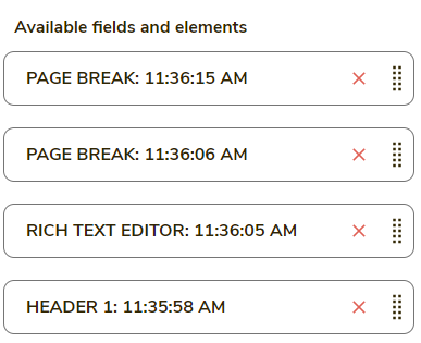
Every time you click an item, it is added as an available item that you can drag into the form in the next step. You can click each of these items as many times as you'd like to add multiple instances of them to the form.
|
Each time you click an item will be added as an available element you can use in the design:
|
| 5 |
Drag all fields and elements that you added in step 4 onto the form canvas. |
 |
| 6 |
Once on the canvas, move the cursor over and then click on each form element to configure it. a. For all elements:
To learn more about filter conditions, click here. b: When you click header text elements, a text area displays where you can type the content you want to appear.
c. When you click rich text elements, you can format paragraphs of text that can also include hyperlinks to reference information for individuals who are completing the form.
d. For page breaks, you can click the Page break button to rename it.
e. Remove any item using the red X that is present when you move the cursor over it.
f. Drag any item to its desired position by clicking the Drag icon that appears when you move the cursor over the field. Then drag it to the new position.
|
a:
b:
c:
d:
e:
f:
|
| 7 |
Add header and rich text elements after the Thank You page to configure what the user sees when they submit the form.
In the example provided, a rich text element has been dragged into position for crafting the form submission confirmation message.
|
|
| 8 |
Click Save & go to Settings. The form design is saved, and the form settings area appears.
|
|
| 9 |
Make any setting updates, including setting the form accent color, font, font size, footer color and text, and duplicate handling logic. Learn more: See web form settings. |
|
| 10 |
Click Save & go to designer. |
 |
| 11 |
Click the Add image button to add a background image to your form.
|
 |
| 12 |
Click the Add logo button to add a logo to your form. |
 |
| 13 |
Adjust the background and logo settings, and click Apply. |
 |
| 14 |
Click Save. When you save, the form remains open, and the form settings you configured are applied. |
 |
| 15 |
Click Preview form.
The form launches in a new tab in preview mode, showing you the most up-to-date saved version of the form. You can click through the page break buttons to navigate the entire form in preview mode without completing any of the required fields. This preview form is not the live form. It cannot be submitted to create records inside GraceBlocks. |
The form in preview mode has this note at the bottom of each page to ensure that users who encounter it understand that it cannot be submitted:
|
| 16 |
Continue to save and toggle between the designer and settings areas until your form's design and layout attributes are fully complete. Then, click Save and close. |
 |


Important notes about web forms
🔔When configuring attachment fields:
- You can specify how many megabytes of attachment space an individual can use when attaching files on a web form. By default, it's 5MB. Increase by going to web form settings and changing the value in the field named MAX SIZE IN MB FOR ATTACHMENTS.
- If you have created an attachment field with categories, each category is its own independent field to be placed on the form designer using the naming convention of <Field name> - <Category>. This allows the independent gathering of information for each category. The uncategorized attachments or a field with no categories will have the specification of - Uncategorized at the end. Be sure to rename the field to be what it should be for individuals using the form. In the example below, Image - Uncategorized is renamed to Video File.
- In the form designer, when multiple attachments are supported, you can specify how many attachments an individual can upload using the Max # Attachments field illustrated below. The default max number of multiple attachments to include in a form is 3.

🔔 When configuring single-select or multiple-select fields with fewer than 32 options, you can choose whether to use buttons or to display a checklist of items. As soon as more than 31 options exist in the list, a different mobile-first control is used for both single-select and multi-select fields.

🔔 Background Images must be at least 1200 pixels in width. If no image is provided, the background is the form accent color.
🔔 If no logo is provided, the logo element is ignored in the rendering of your form.
🔔 Move the cursor over the information icon ( ) for the background and logo settings to learn more about how each setting impacts the form page design.
🔔 If you do not see the most up-to-date form when you use the Preview form button, you need to click Save. Close this preview of the form browser tab, click Save from the form designer, then click the Preview form button again.
🔔 To learn about all of the web form settings and how they work, see web form settings.
🔔 For all records created via a web form, the Added by field is set to the block builder user who created the web form.
🔔 For all records updated via a web form, the Updated by field is set to the block builder who created the web form. (Learn more, see web form duplicate logic.)
🔔 THANK YOU at the bottom of the form is always present. It cannot be removed, and you can add only only text heading or rich text elements after this section. Just as you can configure page break button names, you can also click on the THANK YOU button to control the text that displays to users for the final form submit action. Also, if no text is configured after THANK YOU, users see the following text upon successfully submitting the form:
Thank you, your submission was successful.
🔔 Use the following commands in the URL syntax of a form to add additional logic into the form's behavior by adding an & and then the command detailed below. Eg: https://my.graceblocks.com/form?x=MTIxfGdyYWNlYmxvY2tzXzAxfDY1OQ==&field-1=Test will pass the text of Test into Field-1 of the form automatically.
- &field-#=Test This will pass a value (test in this case) into a field on the form (see step 15 in the table below for more details on this one)
- &internal=true Add this if you want to remove branding from the form when it renders and automatically the page the form is submitted.
- &id=1 Add this to pass in the system ID (in this case the ID is 1) of a specific record you can use this in conjunction with the next option.
- &prefill=true Add this to prefill the web form with information from the specific record id
- To ensure security, you can also generate identify a random key to use in substitute for the System ID. This can be done systematically and with a form using the following formula in a formula field:
- CONCAT('FORM_URL_GOES_HERE&id=',GENERATE_FORM_ID({System ID}),'&prefill=true&internal=true')
🔔IMPORTANT NOTE: If you want to use this to "update" vs. create a new record, in Web Form Settings be sure to set the System ID as duplicate check criteria. Otherwise a new record will be created every time the form is submitted.
🔔 You can embed content into web forms from GraceBlocks by following the following two syntax approaches.
Synatx approach 1: Related Record information. Any information in a related record can be pulled into a form once the related record has been selected. For example, let's say you need to service a customer. You can select that customer from the list of available options and then information about that customer can be pulled into the form.
Example: Use double if the bracket should appear even if null or triple hard brackets if it should only appear if there is content available, [[always show something field]] [[[hide if not present field]]], start with the field name of the related record on the form followed by a double pipe || and then the name of the field on the related record:
Example: Using an RTF form element, any field label or element can support using these tokens.
|
[[Client||Physical Location Name]] - [[Client||Address]] Last Month's Service Summary:
Onsite Contact: Billing Contact: [[[Client||Notes or Special Instructions]]]
|
Condition: Only dispaly when Client is Not NULL - by applying this condition you ensure this information only displays on the form once the representative has selected the customer.
Synatx approach 2: Current Record data prefilled. It is possible to render a form pre-filled by passing the system ID into the form and adding the prefil instruction into the URL. This is most typically done by using a Formula field that constructus the Unique Update URL for a web form.
Example: Using an RTF form element, any field label or element can support using these tokens.
This form allows you to request the escalation of a submitted request. The details of the ticket you selected for escalation is below. Your input helps us prioritize and address your concerns effectively. {{always show something field}} {{{hide if not present field}}}, start with the field name of the related record on the form followed by a double pipe || and then the name of the field on the related record. Any related record already pre-filled into the form can have information pulled throug into the form. However, to pull through data on a newly selected related record, use the hard bracket syntax illustrated in snytax appraoch 1.
| Ticket selected for escalation: | |
| ID | {{System ID}} |
| Name | {{Ticket name}} |
| Details |
{{Details}}
|
| Submitted by | {{Added by}} |
| Submitted on | {{Added on}} |
| Last updated by | {{Updated by}} |
| Last updated on | {{Updated on}} |
Understanding other web form actions
The table below explains the other web form actions that are available from the web forms page. This image provides a reference key for where to find these actions on the web forms modal page.

| # | Action | Description |
| 1 |
Activate the Form submission email notice |
If you would like to be notified any time this form is completed, toggle on this option. When this option is on, the email that is associated with your profile receives an email that contains the form submission details contents every time a form is submitted. Toggle this option off if you want to stop receiving email notices. |
| 2 |
Use the Action dropdown |
Click this dropdown to access actions 3 to 13 in this table. |
| 3 |
Edit form design |
Select this action to configure the pages, fields, text, background image, and logo for the form. You can edit the form design at any time. Saved changes are immediately applied to the form wherever it is in use. For more details about this action, see the actions starting at Step 3 in the prior section, "Adding new web forms." |
| 4 |
Edit form settings |
Select this action to review and update the settings for the form. You can edit form settings at any time. Saved changes are immediately applied to the form wherever it may be in use. Learn more, see web form settings. |
| 5 |
Duplicate this form |
Select this action to create a copy of an existing form. The copy is named Copy of <Form name> and becomes the first form in the list when this action is completed. |
| 6 |
Generate social sharing image |
Select this action to generate a social sharing image that is aligned to the form, using the current form's design and settings. This action controls the image associated with the form URL when it is shared via social media. Learn more, see web form social share image feature. |
| 7 |
Launch form in a new tab |
Select this action to launch the live form that can be completed. |
| 8 |
Copy link to form |
Select this action to copy the form URL. From here, you can paste the form URL wherever it needs to be shared so that you can invite individuals to complete the web form. |
| 9 |
Copy form embed code |
Select this action to grab the embed code text of the form. From here, you can paste the embed code text where the form's code needs to be embedded. This allows the form to be rendered inside another website that you design and control. Learn more, see web forms embed code. |
| 10 |
Make public default |
Select this action to use the selected form as the primary means to add records when users click + Add new record inside the tab. Learn more, see adding a new record. |
| 11 |
Make public |
Select this action to use the selected form as an alternative means to add records. Users will see these options from the right-hand dropdown menu that appears when you move the cursor over + Add new record. Learn more, see adding a new record. |
| 12 |
Make private |
Select this action to make a form private. Private forms are accessible to all builders from the Manage web forms modal page. But users cannot see them from + Add new record. By default, all forms are private, so this action only makes a change to the form's state if it was previously set to public or the public default. |
| 13 |
Delete |
Select this action to delete the web form. When you delete a form, any prior records that were created through the form will still exist, but the URL to the form, if published anywhere, will no longer work. Once deleted, the form cannot be recovered. You must read and accurately follow the instructions provided to confirm that you want to complete the delete action. |
| 14 |
Reorder forms in list using the Drag icon |
Click and hold the Drag icon to drag a web form to the desired location in the list of forms. The list is the same for all builders, so moving a form moves its location in the list for everyone who can access the Manage web forms modal. |
|
15
|
Use URL parameters to pass in form values
|
It is possible to pre-fill a web form with default information, or even to pass data behind the scenes that a user cannot change it. Do this by appending parameters to the end of the form URL. First, get the base form URL by clicking to render the form in a new tab. Then, append syntax using the following logic:
Example 1. Find the field number from the web form designer page; the field number is shown in parentheses ( ) at the end of the field name:
2. Append the field syntax to the URL as follows: Result:
🔔 The f in field must be lower case. 🔔 The values entered must match GraceBlocks exactly; they are case sensitive. 🔔 Spaces and special characters must be honored. If you enter the text, exactly as it is in GraceBlocks, into the URL and press Return, the syntax returns as it needs to for the complete URL string. For example, spaces convert to %20, and apostrophes convert to %27. Share the URL that is generated after you press Return, and this syntax has been added to the URL. 🔔 Only one value can be passed into multi-select fields. 🔔 When trying to pass data into a Collaborator field type using this capability, you can pass the collaborator's ID or email address. Both are visible from the card when you hover over a collaborator's name.
|


